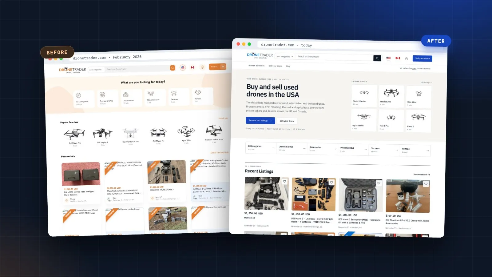

Rather than throw away a platform with years of listings, accounts and search history, we modernised it in place. The marketplace stayed on its proven Laravel foundation and was rebuilt from the inside out: a new visual system, a rewritten homepage, a modern membership and payments flow, structured data for search and AI answers, full analytics, and a brand-new app on the same API.
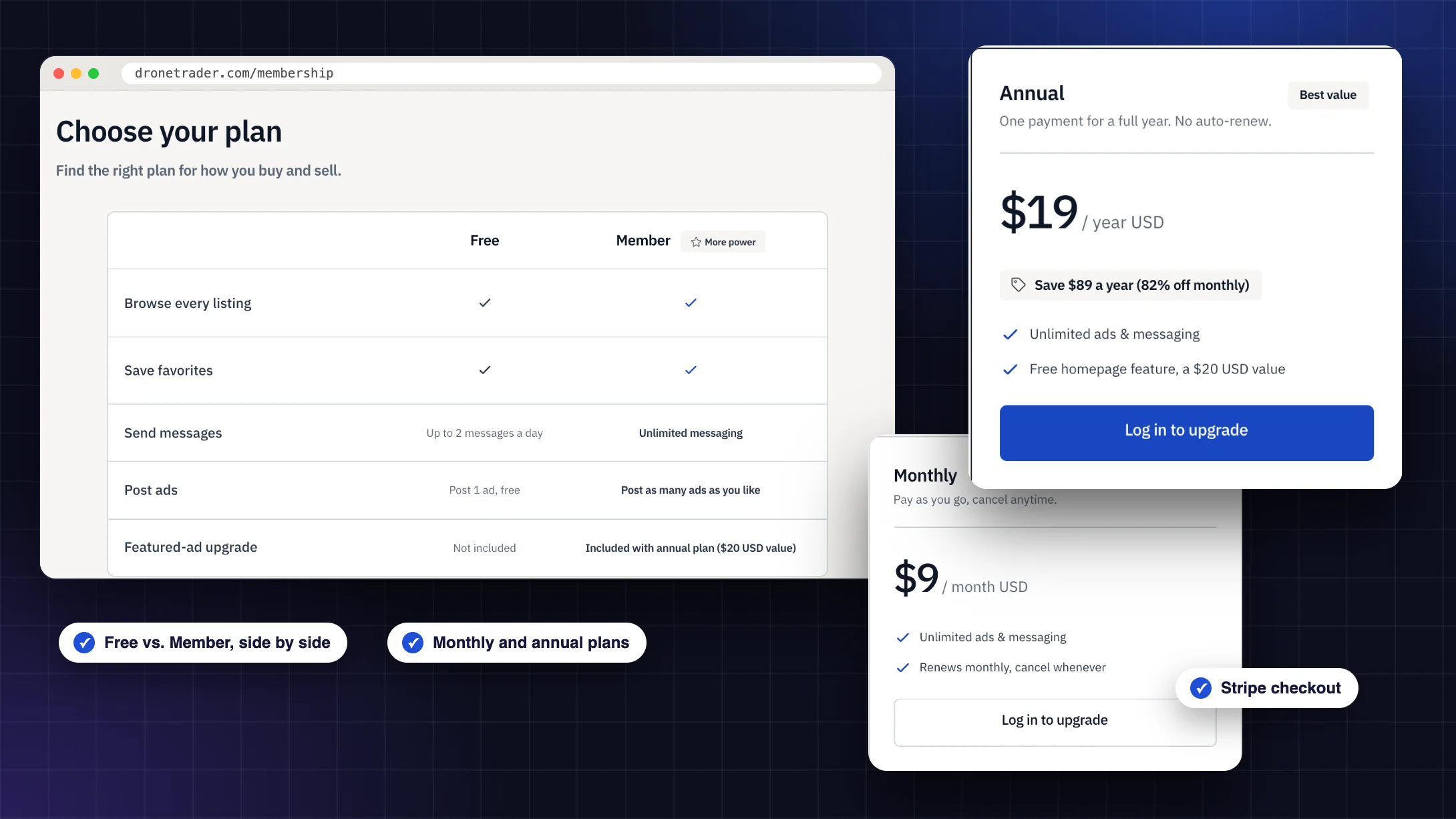
The biggest commercial change was making paid features easy to understand and easy to buy. A new membership page compares Free and Member side by side, with monthly and annual plans and the annual plan’s value spelled out. Checkout moved to Stripe for memberships, listing upgrades (Featured, Top of category, Highlight and Urgent) and Business Directory listings, and every purchase is now tracked through GA4 and Meta, so we can see exactly what drives revenue.
For search and AI answer engines, we added country-specific titles, descriptions and share images for the US and Canadian storefronts, a buyer and seller guide with FAQ schema, live listing counts that refresh hourly, safety content, and llms.txt and crawler rules on each host, so Google and AI assistants can describe DroneTrader accurately and point people to the right country.
We kept everything that worked, a loyal audience and years of listings, and rebuilt everything around it: the look, the paths to purchase and the app.
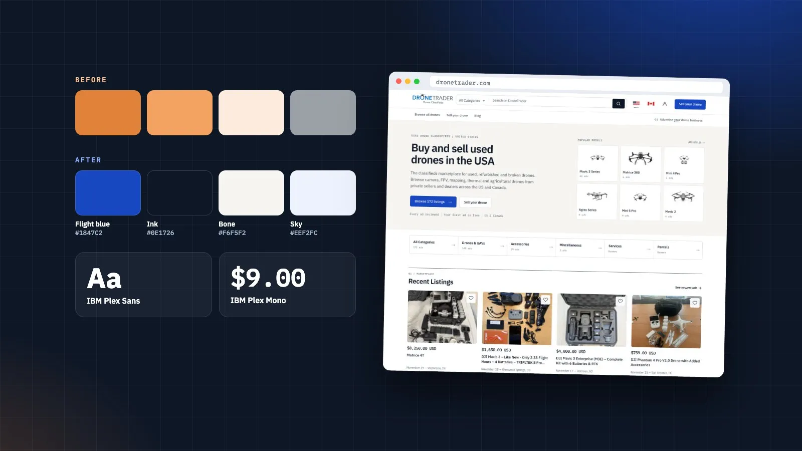
We replaced the orange-and-grey template look with Flight Line, a calmer, more trustworthy system built on a deep flight blue, ink and warm bone backgrounds. IBM Plex Sans handles headlines and interface, while IBM Plex Mono gives prices, ad counts and labels a precise, technical feel that suits the drone community. The new homepage leads with a clear headline, live listing counts, popular models and the categories people actually browse, followed by the newest real listings.
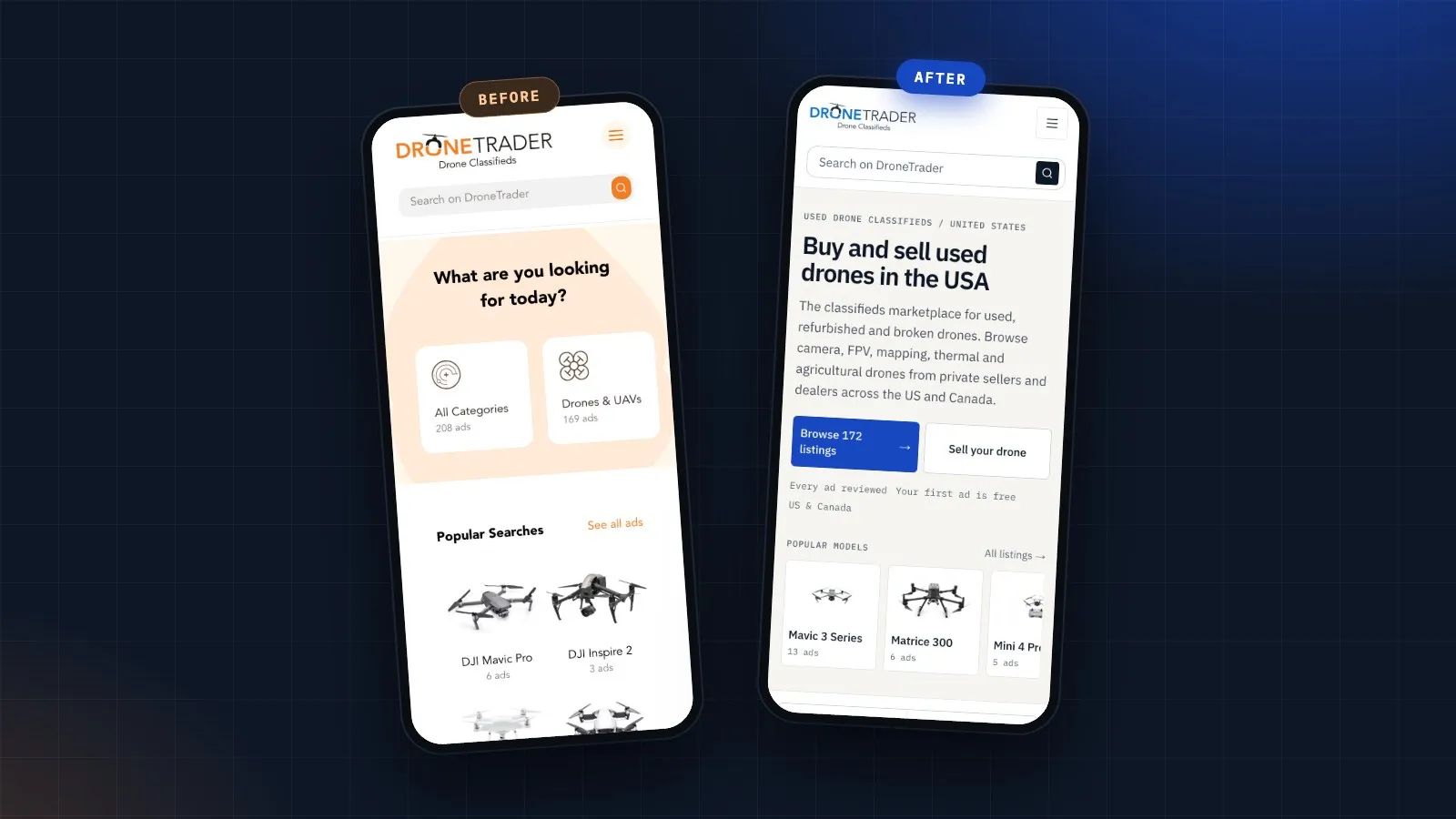
Most buyers browse DroneTrader on their phones, so every section was checked at mobile size first. The old mobile homepage opened on a pastel banner and a grid of popular searches, many showing zero ads. The new one opens with what DroneTrader is, how many listings are live, a primary Browse button next to Sell your drone, and a scrollable row of popular models, with larger tap targets throughout.

The original app was retired, so we rebuilt it from scratch for iOS and Android with React Native and Expo, running on the same API as the website. Version 2 covers the full marketplace: a welcome flow, browsing by country with filters, listing detail and photo galleries, favourites, selling, an inbox and account management. It is in beta testing on both platforms, with a clean, modern interface that matches the new website.
Every part of the overhaul works toward the same goal: help buyers find the right drone faster, and make it easy for sellers to pay for more visibility.


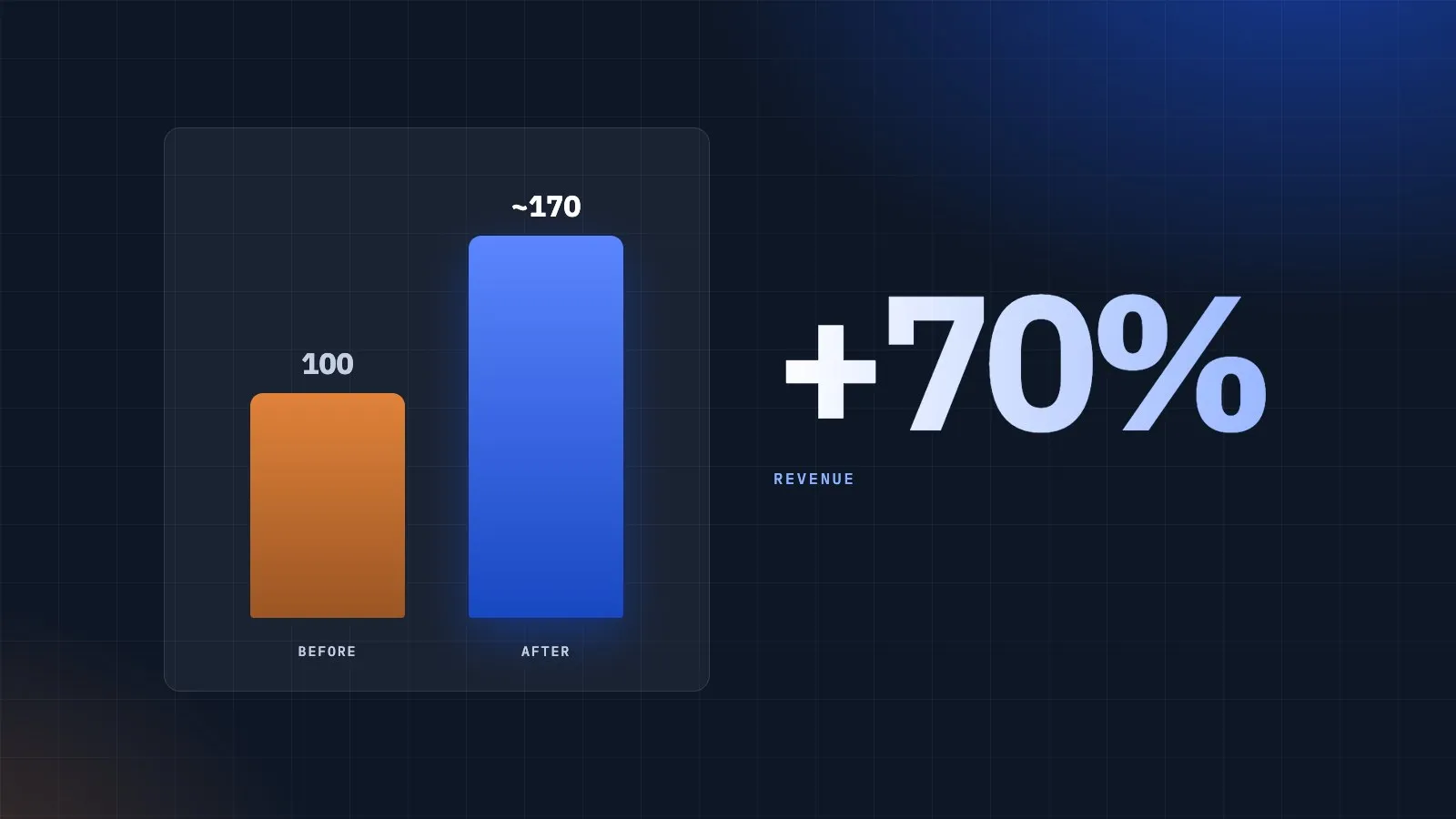
The overhaul paid off where it matters most. After the new design, membership page and Stripe checkout went live, DroneTrader’s revenue rose by roughly 70% compared with the period before the changes, driven by a clearer path to memberships, listing upgrades and directory listings.
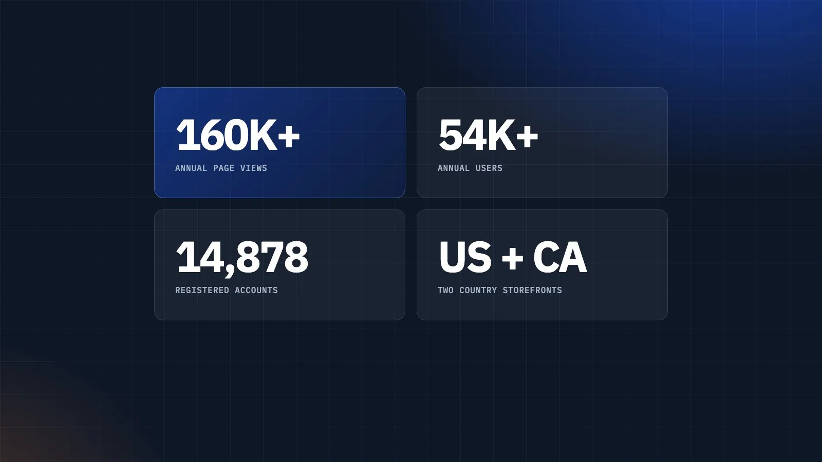
The marketplace now serves more than 160,000 page views and 54,000 users a year across its US and Canadian storefronts and blog, with nearly 15,000 registered accounts. And for the first time, every membership, upgrade and renewal is tracked from the first click to the final payment, so future marketing can be measured in dollars, not guesses.
With a modern design system, a measurable payments flow and a rebuilt app ready for launch, DroneTrader is set up to grow as a marketplace rather than just a listings board.
Custom software, high end websites, leads for your business. We can help...


